Things to Wear That Photograph Well (Especially in Green, Outdoorsy Locations)
If you live somewhere like Chapel Hill, your photo backdrop is basically: trees.Which is great.It’s also the reason some outfits look amazing in your closet… and then disappear into the background once we’re surrounded by green.Here are five things to wear that photograph well in a place with lots of greenery, using a summer color palette that won’t turn you into a walking leaf.
1. A solid top that isn’t the same green as the background
Green-on-green can make you blend in. That doesn’t mean you can’t wear green. It just means you want contrast.
For summer, colors that pop against greenery tend to be navy, medium blue or denim blue, soft pink, coral (not neon), lavender, periwinkle, and teal.
If you love green, go for deep emerald (it reads richer than the leaves) or blue-leaning greens (more teal than grass). Skip bright grassy green and neon anything. Neon can reflect onto your skin and look odd.
2. Mid-tone colors (your best friend in dappled shade)
Green spaces usually mean shade. And shade is lovely… until you wear something that’s too light or too dark.
Mid-tones hold detail and look balanced. Good summer picks include denim blue, seafoam (with contrast, not head-to-toe), dusty rose, teal, and warm gray.
Real-life example: at the NC Botanical Garden, you’ll often get that “sun through the trees” look. Mid-tones keep your outfit from turning into a bright blob or a dark void.
3. A layer that adds shape (and helps you stand out)
Layers create separation. They also give you variety without changing outfits.
Easy summer layers include a light denim jacket, a linen button-up worn open over a tank, or a lightweight cardigan.
This matters in green locations because the background can be visually busy. A layer gives your outfit structure so you don’t get lost in the leaves.
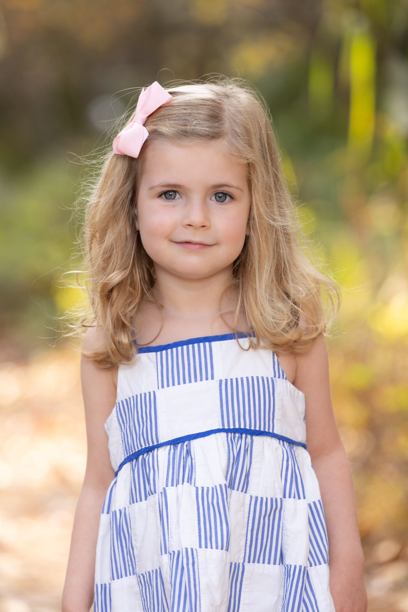
4. Texture over tiny patterns
Tiny patterns (especially tight stripes) can do weird things on camera. Texture gives you interest without visual chaos.
Look for linen, denim, eyelet, subtle ribbed fabrics, or light knits.
If you want patterns, keep them larger scale, low contrast, and simple.
5. Shoes you can walk in (because green locations mean uneven ground)
Parks, trails, gardens, fields. They’re not built for stilettos.
If you’re uncomfortable, it shows up in your face and your posture.
Good options include clean sneakers, flats, or low sandals with a secure strap. (Low boots can work too, if it’s one of those weird spring-to-summer weeks.)
Are your shoes helping you focus on your people… or making you watch every step?
Quick outfit formulas for green backdrops (summer edition)
Navy top with light or medium wash jeans, a light denim jacket, and a simple necklace.
A coral dress (not neon) with neutral sandals and simple earrings.
A periwinkle top with khaki or medium-wash denim, a linen layer, and clean sneakers.
3 easy summer palettes for families (pick 1 main, 1 supporting, 1 neutral)
You don’t need everyone in the same color. You just need a plan.
Here’s the rule I use: pick one main color (it shows up on one or two people), one supporting color (it shows up on one or two people), and one neutral that ties everyone together. Then mix in denim, texture, and small pops of pattern.
Palette 1: navy, soft pink, and cream. Navy can be a dress, polo, or romper. Soft pink can be a top, a dusty rose dress, or a blush skirt. For the neutral, think cream, oatmeal, or light warm gray. One easy setup is Parent 1 in navy, Parent 2 in cream with denim, Kid 1 in soft pink, and Kid 2 in cream with a small pattern that includes navy or pink.
Palette 2: denim blue, coral, and warm gray. Denim blue can be chambray, medium-wash jeans, or a denim dress. Coral is great as long as it’s not neon. Warm gray, tan, and light khaki keep it grounded. A simple setup is Parent 1 in a chambray top with warm gray pants, Parent 2 in a coral dress, Kid 1 in denim with a light neutral (cream, not bright white), and Kid 2 in warm gray with a small stripe that includes denim blue.
Palette 3: teal, lavender, and oatmeal. Teal works best when it leans more blue than green. Lavender (or periwinkle) adds contrast without yelling. Oatmeal, cream, and light warm gray keep it soft. Try Parent 1 in teal, Parent 2 in oatmeal with denim, Kid 1 in lavender, and Kid 2 in oatmeal with a pattern that includes teal or lavender.
What to skip in heavy greenery
Bright grassy greens that match the leaves.
Neon colors (again, they can reflect onto your skin).
Logos and big text.
Tiny stripes and tight patterns that can create weird visual ripples.
A quick word about white (because it’s not as “safe” as people think)
White can pick up a lot of reflected green in leafy locations.
If you love a light look, try cream, oatmeal, light warm gray, or soft chambray instead.
You’ll still look bright, but you won’t get that “why is my shirt minty?” surprise.
Want help choosing outfits?
If you’ve booked a session with me, send me quick phone photos of your outfit options.
I’ll tell you what’s working, what’s blending into the background, and what will feel the most like you.
Your photos should look like you on a good day.
Not you, but in forest camouflage.